
Journal of Geographical Sciences >
Application of geographically weighted regression model in the estimation of surface air temperature lapse rate
|
Qin Yun (1990‒), PhD Candidate, specialized in regional climatology and climate change. E-mail: shuyunchenyun@163.com |
Received date: 2020-05-16
Accepted date: 2020-09-11
Online published: 2021-05-25
Supported by
The National Key R&D Program(2018YFA0605603)
Natural Science Foundation of China(41575003)
Copyright
The surface air temperature lapse rate (SATLR) plays a key role in the hydrological, glacial and ecological modeling, the regional downscaling, and the reconstruction of high-resolution surface air temperature. However, how to accurately estimate the SATLR in the regions with complex terrain and climatic condition has been a great challenge for researchers. The geographically weighted regression (GWR) model was applied in this paper to estimate the SATLR in China’s mainland, and then the assessment and validation for the GWR model were made. The spatial pattern of regression residuals which was identified by Moran’s Index indicated that the GWR model was broadly reasonable for the estimation of SATLR. The small mean absolute error (MAE) in all months indicated that the GWR model had a strong predictive ability for the surface air temperature. The comparison with previous studies for the seasonal mean SATLR further evidenced the accuracy of the estimation. Therefore, the GWR method has potential application for estimating the SATLR in a large region with complex terrain and climatic condition.
QIN Yun , REN Guoyu , HUANG Yunxin , ZHANG Panfeng , WEN Kangmin . Application of geographically weighted regression model in the estimation of surface air temperature lapse rate[J]. Journal of Geographical Sciences, 2021 , 31(3) : 389 -402 . DOI: 10.1007/s11442-021-1849-5
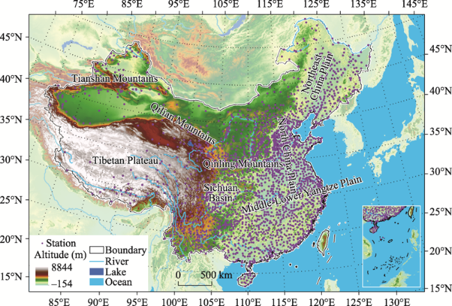
Figure 1 Topography of China and spatial distribution of meteorological stations in the dateset-1 |
Table 1 Moran's Index of residuals returned by the MWR and the GWR model, respectively |
| Jan. | Feb. | Mar. | Apr. | May | Jun. | Jul. | Aug. | Sep. | Oct. | Nov. | Dec. | |
|---|---|---|---|---|---|---|---|---|---|---|---|---|
| MWR | 0.0354** | 0.0518** | 0.0661** | 0.0497** | 0.0449** | 0.0415** | 0.0419** | 0.0486** | 0.0345** | 0.0318** | 0.0471** | 0.0377** |
| GWR | 0.0038 | 0.0102** | 0.0082* | ‒0.0055 | ‒0.0119** | ‒0.0175** | ‒0.0194** | ‒0.0186** | ‒0.0224** | ‒0.0224** | ‒0.0072 | ‒0.0001 |
Note: * and ** indicated the value was significant at the 0.05 and 0.01 level, respectively. The significant positive and the significant negative values represent the clustered and the dispersed spatial relationship, respectively; otherwise, the spatial relationship was random. |
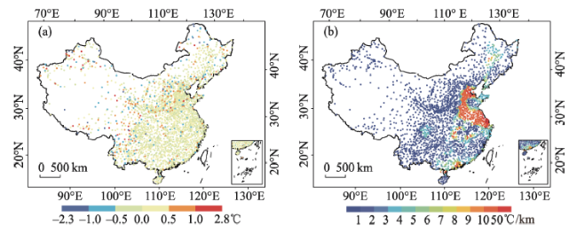
Figure 2 Residual (a) and standard error of β1 (b) at each fit station for the anmual mean series |
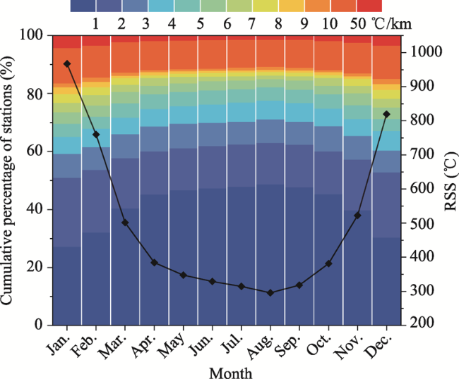
Figure 3 Cumulative percentage of stations with different levels of standard error of βi1 (left axis) and RSS (right axis) for the monthly mean series (The black line showed the monthly variation of RSS. The color bar for the standard error of βi1 was the same as that in Figure 2b.) |
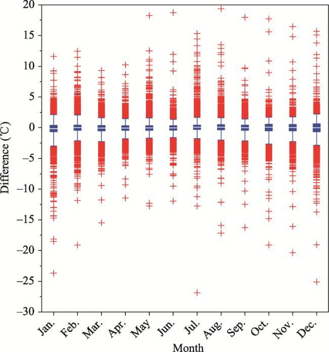
Figure 4 Boxplot of the differences between the predicted and the observed monthly temperatures in the 10,924 automatic stations (The differences above-mentioned were the values subtracted the observed values from the predicted values. The low and the high edge of the boxes represented the position of the lower quartile of the 25th percentile and the upper quartile of the 75th percentile, respectively. The white lines across the boxes represented the medians. The whiskers extending from the boxes represented the 2.5th percentile and the 97.5th percentile, and the red “+” represented the outliers.) |
Table 2 MAE in the assessment stage and the validation stage for each month |
| Jan. | Feb. | Mar. | Apr. | May | Jun. | Jul. | Aug. | Sep. | Oct. | Nov. | Dec. | |
|---|---|---|---|---|---|---|---|---|---|---|---|---|
| Assessment | 0.42 | 0.37 | 0.32 | 0.28 | 0.27 | 0.26 | 0.25 | 0.25 | 0.26 | 0.29 | 0.33 | 0.40 |
| Validation | 0.84 | 0.68 | 0.64 | 0.56 | 0.57 | 0.52 | 0.58 | 0.63 | 0.61 | 0.75 | 0.72 | 0.91 |
Note: The unit of MAE was °C. |
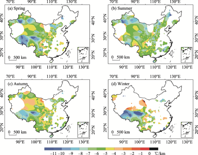
Figure 5 Spatial distribution of seasonal mean SATLR estimated with GWR model (The blank areas in the study area representing the SATLRs were invalid as described in Sections 2.2 and 2.4.) |
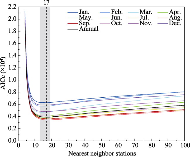
Appendix Figure 1 AICc varied with the increase of nearest neighbor stationsNotes: The number of nearest neighbor stations was 17 for the year, and 17, 14, 13, 17, 17, 17, 19, 19, 19, 19, 17 and 17 for the 12 months from January to December, respectively. The x-value of the vertical dashed line was 17. The x-value of the gray band off the vertical dashed line ranged from 13 to 19. |
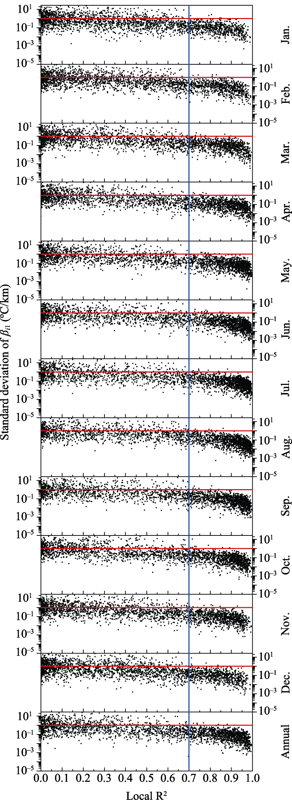
Appendix Figure 2 Standard deviations of βi1 when n varied from 13 to 19Notes: The x-value of a black dot represented the average local R2 when n varied from 13 to 19 at the fit station. The blue vertical line represented the critical value of local R2=0.7, and the red horizontal lines represented the standard deviation of βi1 equal to 1°C/km. The meanings of the parameters above-mentioned were described in Section 2. |
| [1] |
|
| [2] |
|
| [3] |
|
| [4] |
|
| [5] |
|
| [6] |
|
| [7] |
|
| [8] |
|
| [9] |
|
| [10] |
|
| [11] |
|
| [12] |
|
| [13] |
ESRI, 2018. How GWR works [OL]. https://desktop.arcgis.com/en/arcmap/10.3/tools/spatial-statistics-toolbox/how-gwr-regression-works.htm
|
| [14] |
|
| [15] |
|
| [16] |
|
| [17] |
|
| [18] |
|
| [19] |
|
| [20] |
|
| [21] |
|
| [22] |
|
| [23] |
|
| [24] |
|
| [25] |
|
| [26] |
|
| [27] |
|
| [28] |
|
| [29] |
|
| [30] |
|
| [31] |
|
| [32] |
|
| [33] |
|
| [34] |
|
| [35] |
|
| [36] |
|
| [37] |
|
| [38] |
|
| [39] |
|
| [40] |
|
| [41] |
|
| [42] |
|
| [43] |
|
| [44] |
|
| [45] |
|
| [46] |
|
| [47] |
|
| [48] |
|
| [49] |
|
| [50] |
|
| [51] |
|
| [52] |
|
| [53] |
|
| [54] |
|
| [55] |
|
| [56] |
|
| [57] |
|
| [58] |
|
| [59] |
|
| [60] |
|
| [61] |
|
| [62] |
|
| [63] |
|
/
| 〈 |
|
〉 |