Visualization and analysis of local and distant population flows on the Qinghai-Tibet Plateau using crowd-sourced data

  • XU Jun , 1 ,
  • LIU Ju 1, 2 ,
  • XU Yang 1, 2 ,
  • PEI Tao 1, 2
Expand
  • 1. State Key Laboratory of Resources and Environmental Information System, Institute of Geographic Sciences and Natural Resources Research, CAS, Beijing, 100101, China
  • 2. College of Resources and Environment, University of Chinese Academy of Sciences, Beijing, 100049, China

Xu Jun, Associate Professor, specialized in GIS, spatial data mining. E-mail:

Received date: 2020-03-17

  Accepted date: 2020-09-30

  Online published: 2021-04-25

Supported by

Strategic Priority Research Program of Chinese Academy of Sciences, Pan-Third Pole Environment Study for a Green Silk Road (Pan-TPE)(XDA20040401)

National Natural Science Foundation of China(41525004)

National Natural Science Foundation of China(41771477)

National Natural Science Foundation of China(42071376)

Copyright

Copyright reserved © 2021. Office of Journal of Geographical Sciences All articles published represent the opinions of the authors, and do not reflect the official policy of the Chinese Medical Association or the Editorial Board, unless this is clearly specified.

Abstract

Human migration between cities is one important aspect of spatial interaction that not only reflects urban attractiveness but also denotes interactions amongst agglomerations. We therefore implemented a web-based visualization system to analyze and interactively explore local and distant population flow patterns between cities on the Qinghai-Tibet Plateau (QTP). We utilized 2017 Tencent population flow data from which we initially constructed inbound and outbound vectors for cities on the QTP. We then used multidimensional scaling to examine and visualize migration patterns and similarities between cities. Results reveal the presence of six local and three distant human mobility patterns on the QTP as well as average summer monthly migrations more than twice the level of those in the winter.

Cite this article

XU Jun , LIU Ju , XU Yang , PEI Tao . Visualization and analysis of local and distant population flows on the Qinghai-Tibet Plateau using crowd-sourced data[J]. Journal of Geographical Sciences, 2021 , 31(2) : 231 -244 . DOI: 10.1007/s11442-021-1844-x

1 Introduction

Spatial interaction has long been a key area within geographic research (Ullman, 1954; Getis, 1991; Fischer et al., 2010). This variable is an important spatial heterogeneity trait as well as a spatial correlation indicator. The strength of spatial interaction therefore reflects the inter-regional links of material, capital, population, information, and knowledge (Liu et al., 2019) and has been incorporated into research on land use/cover (Seto et al., 2012; Silveira and Dentinho, 2018; Ma et al., 2019), as well as urban structures and functions (Liu et al., 2016; He et al., 2017), urbanization (Xu et al., 2017; Liu et al., 2019), and transportation (Kerkman et al., 2017). Population flow is one of the most important indicators of the intercity spatial interactions. This variable can also be used to study city attractiveness, regional socioeconomic development patterns, and, most recently, urbanization in China (Liu et al., 2019).
The Qinghai-Tibet Plateau (QTP) is a very special region within China as well as globally because of its unique physical and natural landscapes. Even this region is geographically isolated, its natural and social processes have been strongly connected with others over the last decade because of improved transportation infrastructures. Ongoing rapid urbanization on the QTP has further strengthened intercity spatial interactions across this region as well as across China. This means that examining population flows and identifying the spatial characteristics of human mobility patterns are essential to urbanization studies on the QTP.
Coupling of material and energy flows within a region is not just an interactive process within one area but also occurs between one defined zone and its neighbors (Fang and Ren, 2017); this therefore also applies to the population flows on the QTP. Fang and Ren (2017) defined the inner interactions in a system as local coupling while the intra-interactions between the systems were referred to as telecoupling. Thus, inspired by these arguments, we defined population flows among cities on the QTP as local while those between the cities on the QTP and other regions were referred to as distant population flows. We consider that both local and distant human mobility should be investigated when studying the QTP population interactions.
Population migration researches usually utilize census data. Acquiring this kind of data is time-consuming, so studies based on this kind of information often focused on long-term evolution (Tang and Ma, 2007; Aunan and Wang, 2014; Wu and Zhang, 2015) but are weak in capturing dynamic interactions between cities. As big data has emerged, different kinds of crowd-sourced information, including Baidu and Tencent migration data, geo-tagged social media data, have been used to study population migration and intercity interactions (Liu and Shi, 2016; Xu et al., 2017; Ma et al., 2018; Pan and Lai, 2019). In recent example, Liu and Shi (2016) and Xu et al. (2017) studied Chinese Spring Festival population migrations among major cities using Tencent and Baidu migration data, while Belyi et al. (2017) explored global human mobility using a combination of Twitter, Flickr and official migration data. Similarly, migration and location requesting data from Tencent Location Big Data have been used to analyze population flows on the QTP (Yi et al., 2019; Wang et al., 2020). Indeed, compared with traditional statistical information, crowd-sourced data are more ‘real-time’ in nature and easier to acquire; these can therefore provide us with information regarding human mobility dynamic changes and have great potential to reveal collective behaviors and socioeconomic activities. We therefore employed crowd-sourced migration data from Tencent Location Big Data1(1https://heat.qq.com/) to study the QTP human mobility patterns.
Numerous previous studies have utilized statistical methods alongside other indicators to disclose temporal variations and impact effects when studying population migrations (Huo et al., 2016; Aral, 2020; Tan and Chen, 2020). As massive crowd-sourced population flows lead to generation of complex networks such that the population flows form edges while origins and destinations form network nodes, network approaches can therefore be employed to study population migrations. In one example, node centrality indexes can be used to depict the characteristics of flow origins and destinations and therefore discriminate spatial variations (Xu et al., 2017; Pan and Lai, 2019; Wang et al., 2020). At the same time, community detection methods can be used to identify closely related subgroups within a network (Belyi et al., 2017; Wei et al., 2018; Zhang et al., 2020). As statistical methods are not very effective for assessing the spatial characteristics of population migration, network approaches can be used to indicate spatial characteristics of inner interactions in a system, such as the local population flows in this case, but they cannot reflect spatial characteristics of intra-interactions between systems, such as the distant population flows in the QTP case. Geographic visualization has long provided an effective approach for manipulating and exploring spatial data (MacEachren and Kraak, 1997; Andrienko et al., 2008; Dzwinel and Wcisło, 2015). In cases where flows of big data are visualized, workers have usually generalized a flow map by clustering closer events to reduce occlusion and clutter in order to discover major patterns (Guo, 2009; Zhu and Guo, 2014).
As research in this paper tends to identify regions with similar human mobility patterns rather than to assess flow clusters and closely related subgroups, we did not adopt network community detection and flow clustering in this analysis. Instead, we built a web-based visualization system with Echarts (Enterprise Charts)2(2https://echarts.apache.org) to display spatiotemporal variations in population flows and realize interactive exploration. We therefore proposed a vector method to represent human mobility patterns for cities so that similarity can be calculated. A multidimensional scaling (MDS) method was then used to visualize and identify cities with similar human mobility patterns. We examined local and distant population flows on the QTP using Tencent migration data and identified cites with similar human mobility patterns.

2 Study area and data

2.1 Study area

This study is based around analysis of 15 prefecture-level cities in the Qinghai Province and the Tibet Autonomous Region as these occupy most of the plateau (Figure 1). We examined local population flows among these 15 cities as well as distant population flows between them and the other provinces across China.
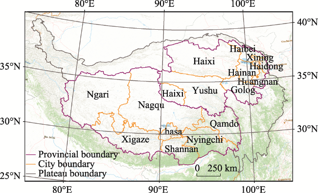
Figure 1 Map showing the study area (Qinghai-Tibet Plateau) assessed in this analysis

2.2 Data description

Daily passenger travel data for 2017 were downloaded from Tencent Location Big Data and used to analyze population flows. The Tencent Location Big Data website publishes daily outbound and inbound migrant numbers for the major Chinese cities. We acquired population flow data for 358 city-level administrative units across China, including all prefecture-level cities, some major county-level cities, four municipalities, the special administrative regions of Hong Kong and Macao, and all cities in Taiwan. Daily passenger data were aggregated by month; just monthly population flow data were utilized in this study.

2.3 Data validation

Tencent migration data for each city encompass the top 10 inbound and outbound human migration routes. Thus, additional inbound and outbound routes for each specific city were extracted by constructing a population flow network and examining the routes of connected cities. We therefore constructed a population flow network based on the migrant numbers with cities forming nodes and the population flow routes between cities forming network edges.
Degree centrality is a simple count of the total number of connections linked to a node within a network; these values are therefore used to validate the constructed network. Within the population flow network, the degree of a city denotes the number of other cites connected to it with population flows. Similarly, ‘out-degree’ refers to the number of outbound human migration routes from a city, while ‘in-degree’ refers to the number of inbound human migration routes to a city. The network generated here shows that Beijing, Shanghai and Guangzhou have the largest out-degree of 256, 249 and 255, respectively (Table 1), while Beijing, Chongqing and Shanghai have the largest in-degree of 244, 240 and 226, respectively. The lowest out-degree and in-degree are both over 10, specifically 14 for Baoshan and 15 for Yangjiang, respectively (Table 1). On the basis of previous work by Xu et al. (2017), it is clear that a population flow network can retrieve more than 90% of the actual population flows by merging the outbound and inbound routes. Network construction greatly improves in- and out-degrees of cities while total migrants can be supplemented. Therefore, passenger travel data from Tencent Location Big Data can be used to analyze population flows among cities.
Table 1 Vertexes degrees within the 2017 population flow network
Rank Out-degree In-degree
1 Beijing 256 Beijing 244
2 Shanghai 249 Chongqing 240
3 Guangzhou 225 Shanghai 226
4 Chongqing 219 Guangzhou 192
5 Shenzhen 215 Shenzhen 189
6 Chengdu 187 Chengdu 165
7 Wuhan 157 Wuhan 126
8 Hangzhou 153 Xi’an 126
9 Tianjin 136 Dongguan 116
10 Dongguan 131 Suzhou 108
…… …… ……
356 Sansha 16 Jieyang 17
357 Akxoki 16 Hezhou 17
358 Baoshan 14 Yangjiang 15

3 Algorithms and system implementation

We developed and implemented a series of algorithms to construct population flow vectors for cities and then used these to identify and visualize similarity between cities using the MDS method. We used Echarts, which includes an interactive charting and visualization library for browsers, for data exploration and visualization.

3.1 Population flow vectors and cosine similarities

We utilized vectors to represent inbound and outbound population flows. The outbound vector comprises all population flows from a specific city to others in a local context as well as provinces in a distant context:
$outVector=\left( outFlo{{w}_{1}},~outFlo{{w}_{2}},~outFlo{{w}_{3}},\ldots \ldots ,outflo{{w}_{n}} \right)$
where n denotes the number of citiesh while outFlow denotes migrant number from this city to other cities or provinces. The inbound vector comprises population flows from other cities or provinces to a specific city, as follows:
$\text{i}nVector=\left( inFlo{{w}_{1}},inFlo{{w}_{2}},inFlo{{w}_{3}},\ldots \ldots ,inFlo{{w}_{n}} \right)$
where inFlow denotes the migrant number from other cities or provinces to this one. The inbound and outbound vectors therefore reveal the origins and destinations of population flows to, or from, a given city, respectively.
Cities with inbound and outbound vectors that have the same origins or destinations of population flows reveal very similar population migration patterns. This has enabled use to compare the population flow patterns of different cities by examining the similarity between inbound or outbound vectors. Cosine similarity has often been used to measure similarities between two nonzero vectors (Dhillon and Modha, 2001; Mahfouz, 2020; Shiri, 2004). The angle between two vectors A and B in a multidimensional space discloses their difference with a larger angle denoting a bigger difference. The cosine of this angle can therefore be utilized to measure the similarity between two vectors, as follows:
$\text{similarity}\left( \text{A},\text{B} \right)=\cos \left( \text{ }\!\!\theta\!\!\text{ } \right)=\frac{A\cdot B}{AB}=\frac{\mathop{\sum }_{i=1}^{n}{{A}_{i}}{{B}_{i}}}{\sqrt{\mathop{\sum }_{i=1}^{n}A_{i}^{2}}\sqrt{\mathop{\sum }_{i=1}^{n}B_{i}^{2}}}$
where Ai and Bi denote the components of vectors A and B, while ||·|| is the mode of the vector. The cosine similarity of two cities will always be positive; thus, a similarity value close to 1 suggests two population flow patterns are almost perfectly similar, while a value close to 0 suggests no similarity between patterns.

3.2 Multidimensional scaling

We utilized the MDS method to reduce the dimensions of population flow vectors as otherwise it would be very challenging to visualize high-dimensional vectors. The MDS approach has been widely used to visualize similarities in multivariate data (Mead, 1992; Cha et al., 2009; He and Shang, 2018; Machado and Mehdipour, 2019). Given N objects that are represented as d-dimensional vectors and all the pairwise similarities or distances between them, the MDS finds a k-dimensional embedding for the N objects that preserve pairwise distances, where k < d (Chen, 2003). We therefore define k = 2 and used the distance between the population flow vectors to calculate the MDS method (Eq. 4), as follows:
$\text{distance }\left( \text{A},\text{B} \right)=1-\text{similarity }\left( \text{A},\text{B} \right)$
The summary presented in Figure 2 demonstrates the generation of two-dimensional (2D) MDS map from multidimensional data. The 2D MDS map therefore displays objects with multivariate attributes on a plane so that clusters can be visually identified (e.g., the objects in the dashed ellipse in Figure 2). The MDS algorithm was realized with Python in this analysis.
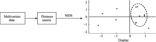
Figure 2 Schematic illustration of MDS approach used in this analysis

3.3 Visualization system implementation

We used Echarts to visualize the population flow data and to prepare statistical charts (Figure 3). Echarts is a JavaScript open source library which can run on numerous platforms. We used IIS as the server while maps and population flow data were stored as GeoJSON files and population flow data are stored in text files, respectively.
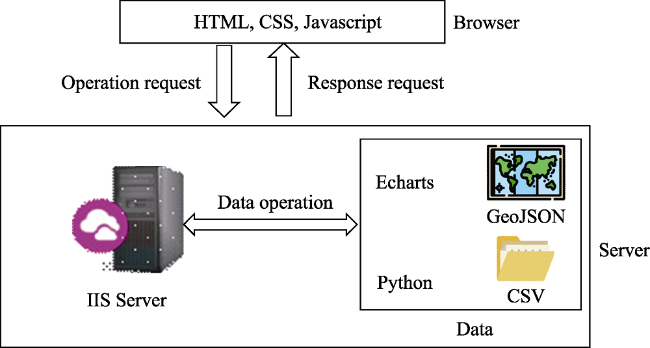
Figure 3 The human mobility visualization system framework used in this analysis
The system used in this analysis has three functions. The first of these was to display the map and statistical population flow results. Users can therefore select a region, time period and direction of the population flow to display with toolbar drop lists. If “China” was selected, this system could display population flows of a selected province on the map and draw a histogram of population flows from this province to others on the right. In contrast, if ‘Qinghai & Tibet’ was selected, the map would show population flows for a selected city in Qinghai or Tibet (Figure 4a). Similarly, selecting a time period, a user can display population flows in one month or over the whole year. Histograms on the right would show local and distant population flows; flow line colors and bubble sizes are proportional to migrant numbers. The second function is used to calculate and display the MDS result of local or distant population flows. Users can therefore determine the spatial pattern of population flows with ease (Figure 4b). The third function in this approach comprises interactive exploration. Thus, in a population flow map, the population volume of a histogram bar can be displayed if we place the cursor on the bar. Similarly, placing the cursor on a flow will display the volume of this flow on the legend bar (Figure 4a). Users can also move two cursors on the legend bar on the lower-left corner to show a certain range of population flows. When a MDS map is displayed, clicking on a city on the map can show the population flows of this city. The example presented in Figure 4b shows the MDS results of the distant outbound flows for March 2017 as the cities of Lhasa, Xigaze, Shannan, Nyingchi, and Qamdo form a cluster. Thus, if we move the cursor around these cities on the MDS display, it is clear that they all have similar distant outflow population migration patterns that large outflow populations pass into Sichuan, Chongqing and Yunnan (Figure 4b).
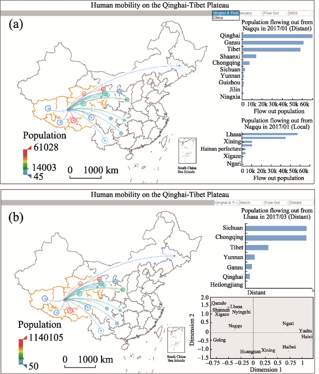
Figure 4 Interface of the human mobility visualization system (a) and interactive exploration (b) in this analysis

4 Visual analytics of human mobility patterns

Visualization and interactive exploration allow us to efficiently examine the spatiotemporal patterns of the QTP population flows.

4.1 Human mobility spatial patterns

Cities on the QTP are characterized by different local and distant human mobility patterns. It is clear that some exhibit more local human mobility while others are characterized by more distant human mobility. The MDS approach used here further illustrates migration pattern similarities.
The data presented in Figure 5 summarize the MDS configuration according to 2017 inbound vectors. It is clear that cities with similar patterns are closer to each other on this display. Figure 5a shows that cities on the QTP are characterized by different local mobility patterns. The Tibetan autonomous prefectures of Haibei, Hainan, and Golog as well as the city of Haidong form a group characterized by similar local patterns. Indeed, further exploration of flow maps shows that they all experienced the in-flow of numerous people from the cities around Xining. A second group of cities includes Nagqu, Nyingchi, Shannan and Xigaze; these have all experienced in-flows of numerous people coming from Lhasa, Ngari, Shannan and Xigaze. Ngari and Qamdo also exhibit the same pattern as people have moved in from Lhasa, Shannan, Xigaze and Nyingchi. It is also noticeable that the two capital cities Lhasa and Xining are characterized by similar patterns; both of these agglomerations have experienced large-scale migration from almost every QTP city.
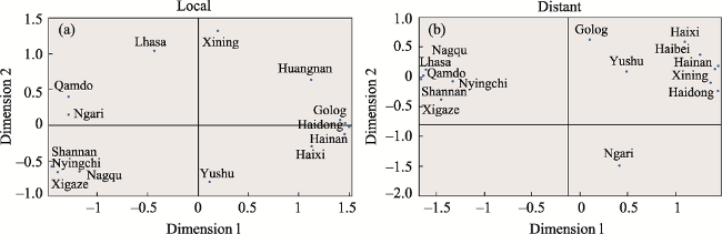
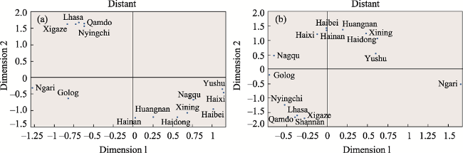
Figure 5 The MDS diagrams based on local (a) and distant (b) human mobility patterns for cities on the QTP according to 2017 inbound population flow vectors
In contrast to local human mobility patterns, distant human mobility patterns on the QTP can be clustered into three distinct groups (Figure 5b). All cities in Qianghai form a group, while those in Tibet other than Ngari form another; this indicates that the cities in Qinghai and Tibet have experienced totally different population flow interactions from other provinces. Maps show that outbound population flows of cities in Tibet tend to have had more migrants to, or form, Sichuan, Yunnan, and Chongqing, while cities in Qinghai tend to have had more migrants to, or from, Shaanxi, Gansu and Henan. Ngari is a special region as population exchange here has tended to have been evenly distributed across all other provinces (Figure 6).
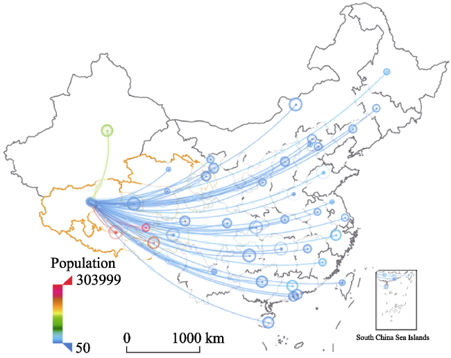
Figure 6 Map showing 2017 inbound population flows to Ngari
The MDS result presented in his paper was then used to further group cities according to their closeness. The map in Figure 7 indicates that cities on the QTP can be classified into six groups base on local human mobility patterns as well as into three groups based on distant human mobility patterns. It is also noteworthy that cities with similar human mobility patterns tend to be spatially connected.
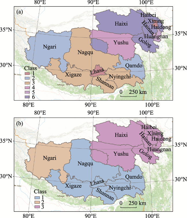
Figure 7 Map showing the spatial distributions of cities with similar local (a) and distant (b) human mobility patterns on the Qinghai-Tibet Plateau

4.2 Human mobility temporal patterns

Although the system applied in this paper is able to reveal population flows that characterize a city or a province within a specific time period, temporal variations cannot be assessed. We therefore further examined overall temporal variations in population flows. The data in Figure 8a reveal average daily local human mobility values for each month, in other words passengers traveling between Tibet and Qinghai or between cities in Tibet and in Qianhai, respectively. In contrast, the data in Figure 8b show average daily distant human mobility for each month, in other words, the passengers traveling between cities in Qinghai or Tibet and cities in other provinces. Local and distant human mobility values peak in July and August; data show that the number of monthly migrants in summer is more than twice that seen in winter which means that human mobility on the QTP is greatly influenced by climate. Low temperatures and air oxygen contents reduce the QTP attractiveness to tourists and also limit the mobility of local people. Another subtle peak also presents which shows that more people came to visit Tibet from other provinces in February and March; this is due to the Peach Flower Festival in Nyingchi in March which attracted a large number of tourists.
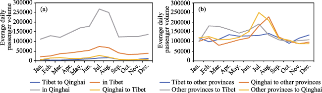
Figure 8 Temporal variation of local (a) and distant (b) human mobility on the Qinghai-Tibet Plateau
Data show that both migrants and the mobility patterns varied over the course of a year. In one example, the MDS results derived from distant outbound city vectors in January show that Ngari and Golog possessed similar patterns in January (Figure 9a). In contrast, Golog is characterized by a distant mobility pattern distinct from Ngari but similar to Nagqu (Figure 9b). This is because the distant human mobility pattern seen in Golog in January was different from that seen in July. It is clear in January, distant outbound migration from Golog went mainly to the provinces in the eastern half of China. Distant outbound population movements from Golog went to just a few provinces in the middle of the eastern half of China during July (Figure 10).
Figure 9 MDS maps for cities on the Qinghai-Tibet Plateau on the basis of distant outbound population flow vectors for January (a) and July (b) of 2017
Figure 10 Outbound flows from Golog in January (a) and July (b) of 2017

5 Discussion

We have explored spatial population flows on the QTP in this paper and have determined local and distant population flow patterns. There are two points that should be noted.
In the first place, clusters derived from MDS may not be consistent with results from other clustering algorithms (Chen, 2003). In one example, if we group cities on the QTP on the basis of 2017 distant inbound population flow vectors using the hierarchical cluster method, the result seen is basically the same as that seen in Figure 5b. It is clear that Haixi is closer to the Xining-Haidong cluster than to Golog and Yushu in the MDS map, but hierarchical cluster classified this into the Golog-Yushu cluster (Figure 11). Interactive exploring the population flow map shows that Haixi and Xining have more people derived from Northeast China, including Gansu, Shaanxi and Xinjiang, while Yushu and Golog have more people from Southwest China, including Sichuan, Yunnan and Guizhou. The MDS analysis works better in this case although caution is needed when clustering algorithms are applied directly to this configuration.
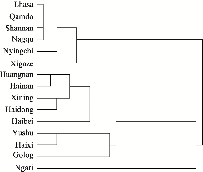
Figure 11 Hierarchical cluster results for 2017 based on distant inbound population flow vectors
Secondly, we used Tencent passenger data for this analysis, including routes with the top ten inbound and outbound numbers of passengers. The research presented here could be significantly improved if data for more population flow routes become available. Additional sources, such as Baidu migration and data from ticked booking platform, could also be used as supplements.

6 Conclusions

We have developed a web-based visualization system to interactively explore local and distant human mobility on the QTP using 2017 crowd-sourced population flow data for the major cities in China. We employed vector to present population flows and MDS algorithm to detect regions with similar human mobility patterns. The method proposed in this study could be used in the future to identify similar patterns in population as well as other flows.
We have identified cities with similar human mobility patterns and have examined temporal variations in the QTP population flows. The results of this study can be summarized in four points. In the first place, cities with similar distant human mobility patterns tend to cluster together spatially. Results show that Qinghai and Tibet show obviously different distant human mobility patterns; more migrants have moved between Qinghai and Shaanxi, Gansu, and Henan, while more people have migrated between Tibet and Sichuan, Yunnan, and Chongqing. Secondly, data show that cities on the QTP can be clustered into three groups based on distant human mobility patterns. It is clear that Lhasa, Shannan, Nyingchi, Qamdo and Xigaze possess very similar distant human mobility patterns, while Xining and its neighboring cities have approximately similar distant human mobility patterns. Results also show that the distant human mobility patterns of Ngari are totally different from other cities. Third, while six clear patterns are evident in local population flows, some cities sharing similar patterns are not close spatially. Fourth, results show that temporal variations in human mobility patterns on the QTP are distinct; monthly migrations in summer occur at twice the rate of those seen in winter.
[1]
Andrienko G, Andrienko N, Dykes J et al., 2008. Geovisualization of dynamics, movement and change: Key issues and developing approaches in visualization research. Information Visualization, 7(3):173-180.

[2]
Aral M M, 2020. Knowledge based analysis of continental population and migration dynamics. Technological Forecasting and Social Change, 151:119848.

[3]
Aunan K, Wang S, 2014. Internal migration and urbanization in China: Impacts on population exposure to household air pollution (2000-2010). Science of the Total Environment, 481(May 15):186-195.

[4]
Belyi A, Bojic I, Sobolevsky S, Sitko I et al., Global multi-layer network of human mobility. International Journal of Geographical Information Science, 31(7):1381-1402.

DOI PMID

[5]
Cha J, Kim S, Lee Y, 2009. Application of multidimensional scaling for marketing-mix modification: A case study on mobile phone category. Expert Systems with Applications, 36(3, Part 1):4884-4890.

[6]
Chen C, 2003. Mapping Scientific Frontiers: The Quest for Knowledge Visualization. London and New York: Springer-Verlag.

[7]
Dhillon I S, Modha D S, 2001. Concept decompositions for large sparse text data using clustering. Machine Learning, 42(1/2):143-175.

[8]
Dzwinel W, Wcisło R, 2015. Very fast interactive visualization of large sets of high-dimensional data. Procedia Computer Science, 51:572-581.

[9]
Fang C L, Ren Y F, 2017. Analysis of emergy-based metabolic efficiency and environmental pressure on the local coupling and telecoupling between urbanization and the eco-environment in the Beijing-Tianjin-Hebei urban agglomeration. Science China Earth Sciences, 47(7):833-846. (in Chinese)

[10]
Fischer M M, Reismann M, Scherngell T, 2010. Spatial interaction and spatial autocorrelation. In: Anselin L, Rey J S Rey (eds). Perspectives on Spatial Data Analysis. Berlin, Heidelberg:Springer, 61-79.

[11]
Getis A, 1991. Spatial interaction and spatial autocorrelation: A cross-product approach. Environment and Planning A, 23(9):1269-1277.

[12]
Guo D S, 2009. Flow mapping and multivariate visualization of large spatial interaction data. IEEE Transactions on Visualization and Computer Graphics, 15(6):1041-1048.

DOI PMID

[13]
He J, Li C, Yu Y et al., 2017. Measuring urban spatial interaction in Wuhan urban agglomeration, central China: A spatially explicit approach. Sustainable Cities and Society, 32:569-583.

[14]
He J, Shang P, 2018. Multidimensional scaling analysis of financial stocks based on Kronecker-delta dissimilarity. Communications in Nonlinear Science and Numerical Simulation, 63(Oct.):186-201.

[15]
Huo J, Wang X-M, Zhao N et al., 2016. Statistical characteristics of dynamics for population migration driven by the economic interests. Physica A: Statistical Mechanics and its Applications, 451:123-134.

[16]
Kerkman K, Martens K, Meurs H, 2017. A multilevel spatial interaction model of transit flows incorporating spatial and network autocorrelation. Journal of Transport Geography, 60:155-166.

[17]
Liu S B, Yang S, Wang Z, 2019. Characteristics and formation mechanism of China's provincial urbanization spatial correlation based on population flow. Acta Geographica Sinica, 74(4):648-663. (in Chinese)

[18]
Liu W, Shi E, 2016. Spatial pattern of population daily flow among cities based on ICT: A case study of “Baidu Migration”. Acta Geographica Sinica, 71(10):1667-1679. (in Chinese)

[19]
Liu X, Kang C, Gong L et al., 2016. Incorporating spatial interaction patterns in classifying and understanding urban land use. International Journal of Geographical Information Science, 30(2):334-350.

[20]
Ma E, Cai J, Lin J et al., 2019. Explanation of land use/cover change from the perspective of tele-coupling. Acta Geographica Sinica, 74(3):421-431. (in Chinese)

[21]
Ma T, Lu R, Zhao N et al., 2018. An estimate of rural exodus in China using location-aware data. PLoS ONE, 13(7):e0201458.

DOI PMID

[22]
MacEachren A M, Kraak M J, 1997. Exploratory cartographic visualization: Advancing the agenda. Computers & Geosciences, 23(4):335-343.

[23]
Machado J T, Mehdipour S H, 2019. Multidimensional scaling analysis of the solar system objects. Communications in Nonlinear Science and Numerical Simulation, 79:104923.

[24]
Mahfouz M M A, 2020. A protection scheme for multi-distributed smart microgrid based on auto-cosine similarity of feeders current patterns. Electric Power Systems Research, 186:106405.

[25]
Mead A, 1992. Review of the development of multidimensional scaling methods. Journal of the Royal Statistical Society, Series D (The Statistician), 41(1):27-39.

[26]
Pan J, Lai J, 2019. Spatial pattern of population mobility among cities in China: Case study of the National Day plus Mid-Autumn Festival based on Tencent migration data. Cities, 94:55-69.

[27]
Seto K C, Reenberg A, Boone C G et al., 2012. Urban land teleconnections and sustainability. Proceedings of the National Academy of Sciences, 109(20):7687-7692.

[28]
Shiri A, 2004. Introduction to modern information retrieval. 2nd ed. Library Review, 53(9):462-463.

[29]
Silveira P, Dentinho T P, 2018. A spatial interaction model with land use and land value. Cities, 78:60-66.

[30]
Tan X, Chen X, 2020. The change of intensity and influence factors of interprovincial population migration in Heilongjiang Province. Journal of Heibei Normal University (Natural Science Edition), 44(5):1-11. (in Chinese)

[31]
Tang J, Ma Z, 2007. Migration selectivity in China: An analysis based on the 2000 census data. Population Research, 31(5):42-51.

[32]
Ullman E L, 1954. Geography as spatial interaction. Annals of Association of the American Geographers, 44(3):283-284.

[33]
Wang N, Wang H, Du Y et al., 2020. Spatiotemporal patterns of in- and out-bound population flows of the Qinghai-Tibet QTP. Acta Geographica Sinica, 75(7):1418-1431. (in Chinese)

[34]
Wei Y, Song W, Xiu C et al., 2018. The rich-club phenomenon of China’s population flow network during the country's spring festival. Applied Geography, 96:77-85.

[35]
Wu X, Zhang Z, 2015. Population migration and children’s school enrollments in China, 1990-2005. Social Science Research, 53:177-190.

PMID

[36]
Xu J, Li A, Li D et al., 2017. Difference of urban development in China from the perspective of passenger transport around Spring Festival. Applied Geography, 87:85-96.

[37]
Yi J, Du Y, Tu W, 2019. Spatiotemporal pattern of population distribution in the Qinghai-Tibet QTP during the National Day holidays: Based on geospatial big data mining. Journal of Geo-information Science, 21(9):1367-1381. (in Chinese)

[38]
Zhang W, Chong Z, Li X et al., 2020. Spatial patterns and determinant factors of population flow networks in China: Analysis on Tencent Location Big Data. Cities, 99:102640.

[39]
Zhu X, Guo D, 2014. Mapping large spatial flow data with hierarchical clustering. Transactions in GIS, 18(3):421-435.

Outlines

/